Matplotlib logo

Matplotlib CHEAT SHEET

[ SKILLS: 35 • SECTIONS: 7 ]

Matplotlib is a comprehensive Python library for creating static, animated, and interactive visualizations. This Skill Tree provides a structured learning path to master data visualization with Matplotlib. It's perfect for data science beginners, offering a clear roadmap to understand plot types, customization, and integration into data analysis workflows. Through hands - on, non - video courses and practical exercises in an interactive plotting playground, you'll gain real - world experience in creating engaging data visualizations.

POWERED BY
LABEX.IO

TABLE OF CONTENTS

[ SECTIONS: 7 • COMMANDS: 35 ]
1.

BASIC CONCEPTS

Fundamental concepts of Matplotlib, including importing Matplotlib, understanding figures and axes, setting figure size and DPI, and saving figures to files.

Importing Matplotlib is the first step in using the library for data visualization in Python. It allows you to access Matplotlib's functionality.

Figures and axes are fundamental components of Matplotlib. Figures represent the entire window or page, while axes are the individual plotting areas within a figure.

Matplotlib allows you to save your plots as image files, such as PNG or JPEG, to share or use in reports.

2.

PLOTTING DATA

Skills related to creating various types of plots and visualizations in Matplotlib.

Line plots are used to visualize data points connected by straight lines, commonly used for time series data.

Scatter plots display individual data points as markers on a graph, often used to show relationships between two variables.

Bar charts represent data using rectangular bars, suitable for displaying categorical data and comparisons between categories.

Histograms are used to visualize the distribution of numerical data, showing the frequency of data points in different bins.

Box plots display the distribution of data, including median, quartiles, and outliers, making them useful for data summary.

Heatmaps represent data using a color gradient, often used for displaying matrices or correlation between variables.

Error bars are added to plots to represent uncertainty or variability in data points, common in scientific data visualization.

Stacked plots show multiple datasets stacked on top of each other, useful for visualizing contributions to a whole.

Fill between plots create shaded regions between two curves, often used to highlight a specific range of values.

3.

ADVANCED PLOTTING

Advanced techniques and features for creating complex visualizations in Matplotlib.

Subplots allow you to create multiple plots within a single figure, facilitating side-by-side visual comparisons.

Secondary axes enable you to plot multiple datasets with different scales on the same plot for better data comparison.

Logarithmic scales can be applied to axes to handle data with a wide range of values, making visualization more informative.

Polar charts are specialized plots used to display data in a circular or radial format, suitable for data with directional relationships.

3D plots provide a way to visualize data in three dimensions, allowing you to explore complex spatial relationships.

4.

PLOT CUSTOMIZATION

Techniques for customizing the appearance of Matplotlib plots.

You can customize the appearance of lines in plots by changing their styles and colors to make your visualizations more distinctive.

Titles and labels can be added to plots to provide context and make your visualizations more informative.

Legends help identify different elements in a plot; you can configure their position and appearance for clarity.

Customize axis ticks to control their appearance and labeling for improved readability.

Grid lines can be added to plots to aid in data interpretation; their style and visibility can be customized.
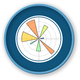
Text annotations allow you to add additional information to your plots, such as explanations or notes.

Tables can be embedded within Matplotlib plots to display tabular data alongside visualizations.

5.

SPECIALIZED PLOTS

Advanced types of plots for specific data visualization needs.

Pie charts represent data as sectors of a circle, showing the relative proportions of different categories.

Violin plots combine aspects of box plots and kernel density estimation to visualize data distributions.

Contour plots display three-dimensional data as two-dimensional contours or level curves, useful for representing surfaces.

Quiver plots are used to visualize vector fields, where data points are represented as arrows with direction and magnitude.

Stream plots show the flow of a fluid or particles in a field, helpful in fluid dynamics and other flow-related analyses.

6.

INTERACTIVE FEATURES

Skills related to adding interactivity to Matplotlib plots.

Interactive backends enable the creation of interactive plots with features like zooming, panning, and data point selection.

Widgets and sliders can be added to Matplotlib plots to allow users to interactively adjust parameters and visualize changes.

7.

ADVANCED TOPICS

Advanced topics and techniques in Matplotlib for experienced users.

Custom backends allow advanced users to create their own Matplotlib backends for specific rendering and display needs.

Matplotlib supports creating animations to visualize changes in data over time, making it useful for dynamic data.

Event handling in Matplotlib allows you to respond to user interactions with plots, enabling more interactive applications.

Advanced users can customize Matplotlib's configuration settings to tailor the library's behavior to specific requirements.

ABOUT THIS CHEAT SHEET

This Matplotlib cheat sheet is part of LabEx's comprehensive programming education platform. Explore interactive labs, courses, and hands-on projects to master Matplotlib and other technologies.

LEARN MATPLOTLIB ON LABEX
MATPLOTLIB CHEAT SHEET • GENERATED 7/18/2025 POWERED BY LABEX.IO